
Tools: Shape tool, Eyedropper tool, Type tool
The Netherlands based, De Stijil movement embraced an abstract, pared-down aesthetic centred in basic visual elements such as geometric forms and primary colours. This movement was particularly against the decorative excesses of Art Deco. The creators of this movement envisioned this as a universal visual language that's appropriate to the modern era, a time of a new and spiritualised world order. De Stijil was led by Theo van Doesburg and Piet Modrian.
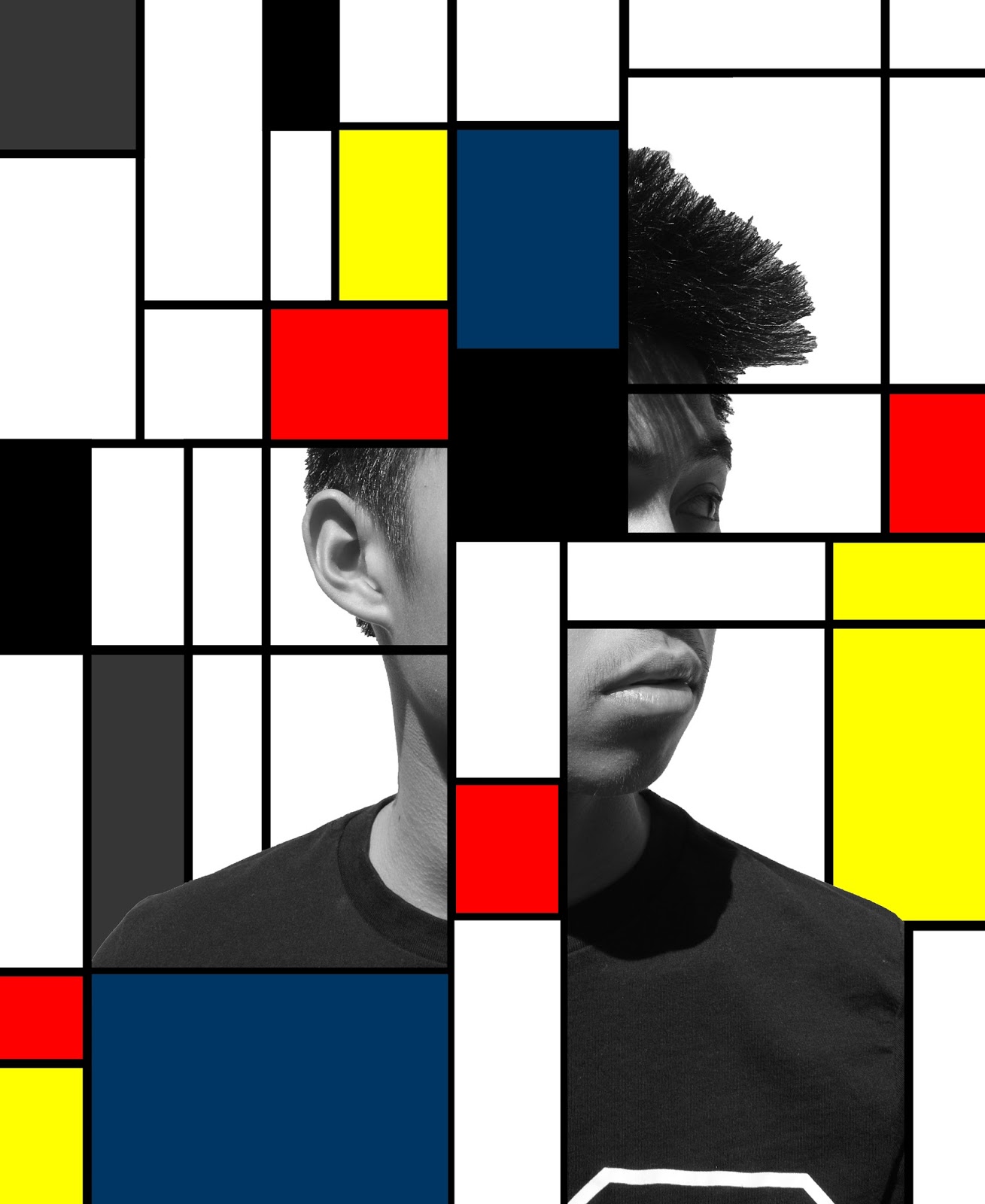
De Stijil artists embraced a visual language consisting mainly of rendered geometric forms, usually straight lines, squares and rectangles - and primary colours.
This week's task required us to redesign a layout spread of the magazine of your choice and infuse the elements of De Stijil in your design. So, this week I incorporated a lot of geometric shapes, mostly squares and rectangles and also bold primary colours, which I rarely use in my design. I balanced our the bulky De Stijil inspired font with some San-Serif fonts to balance out this layout spread and increase the legibility.

Inspirations:


No comments:
Post a Comment